Colourary – Designing and Shipping an iOS Colour Toolkit
Overview
Colourary is an iPhone-first colour toolkit I conceived, designed and shipped from idea to App Store. It brings colour exploration, palette building, accessibility checks and practical application into one focused experience.
I led the end-to-end work: product strategy, UX/UI, visual direction, design-system foundations, AI-assisted SwiftUI delivery, testing and release preparation.
The problem
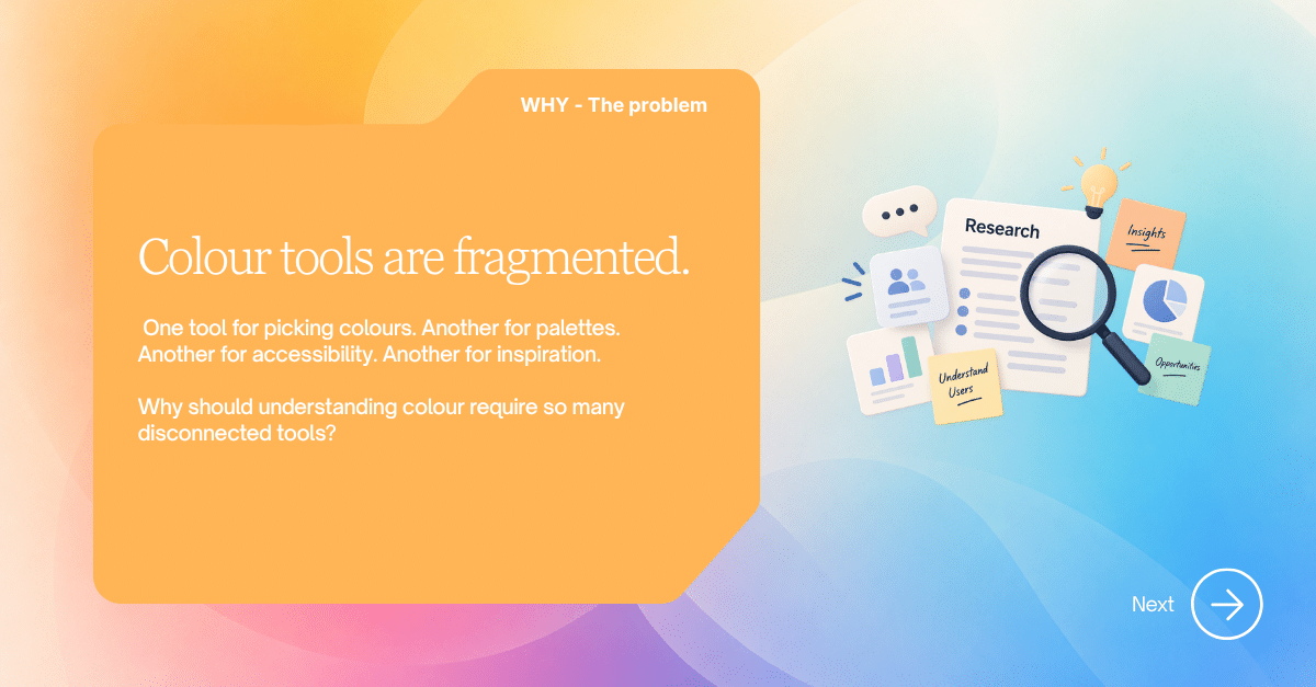
Colour tools are fragmented. People often need one app to pick a colour, another to build a palette, another to check accessibility and another for inspiration. This makes a simple creative decision feel unnecessarily technical and disconnected.
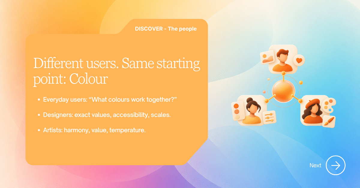
Three audiences shared the same starting point but needed different levels of depth: everyday users wanted to know which colours work together; designers needed exact values, tonal scales and WCAG contrast checks; artists needed harmony, value and temperature guidance.
Product principle
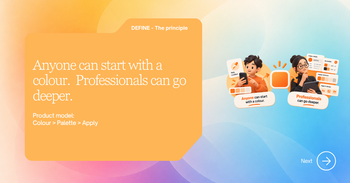
Anyone can start with a colour. Professionals can go deeper.
I organised the product around a simple model: Colour → Palette → Apply. The main journey stays easy to understand, while advanced controls appear only when they are useful.
Defining the first release
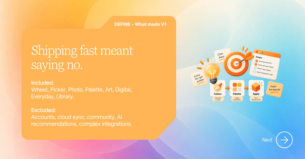
Shipping quickly meant being deliberate about scope. The first release included a colour wheel and exact picker, photo extraction, palette building, Art guidance, Digital tools, Everyday colour directions and a searchable Library.
Accounts, cloud sync, community features, remote AI recommendations and complex integrations were intentionally excluded. This kept the experience private, focused and achievable without weakening the core idea.
Designing the journey
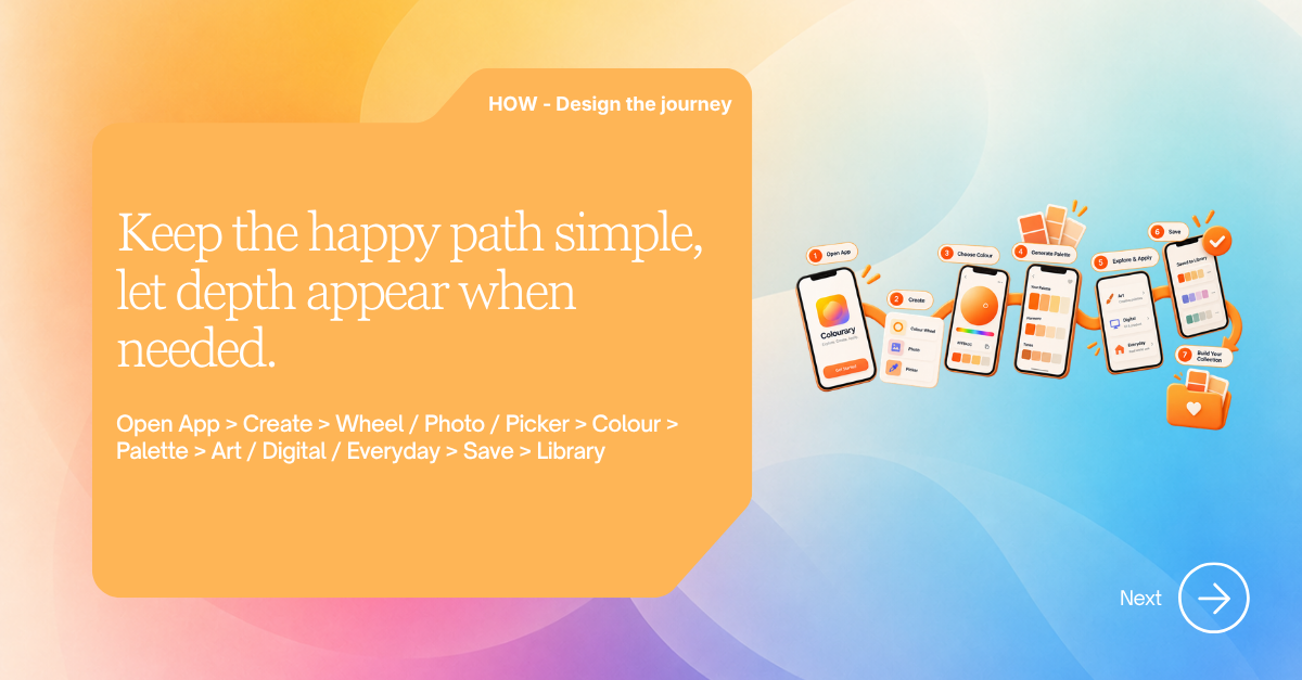
The experience follows a clear progression: create from a wheel, photo or exact value; inspect the colour; generate and refine a palette; apply it through Art, Digital or Everyday guidance; then save it to the Library.
For product and interface designers, Colourary can generate perceptual tonal scales, compare WCAG contrast and preview light and dark UI roles. For artists and everyday users, the same colour becomes understandable through more familiar, contextual guidance.
From Figma to the App Store
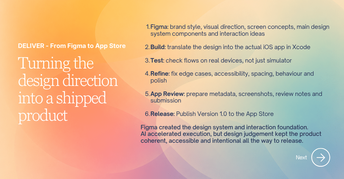
Figma established the brand, visual language, core components and interaction direction. I translated that intent into a native SwiftUI app in Xcode, then refined real-device behaviour, accessibility, spacing and edge cases before preparing the App Store metadata, screenshots and review materials.
AI compressed the time between design decisions and implementation. It accelerated execution, but the product strategy, interaction choices, accessibility decisions and final quality remained design-led.
Outcome
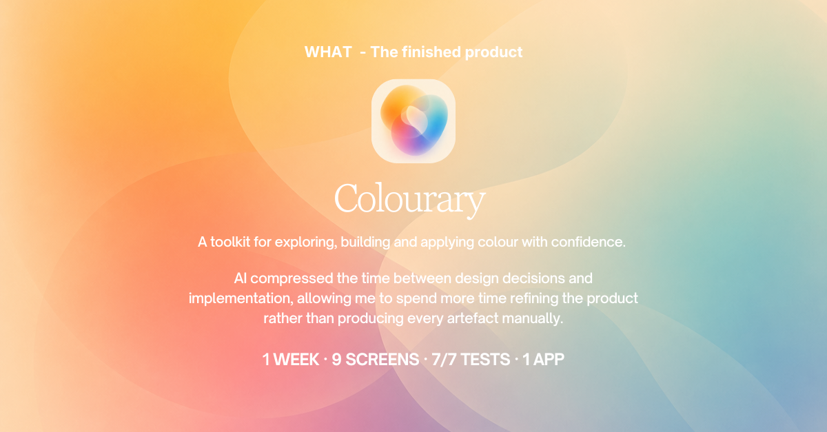
In one week, Colourary progressed from a clearly framed problem to a coherent nine-screen iOS product and App Store release. The result is a private-by-design tool with no account, advertising or tracking: photos are processed on-device and saved colours remain in local storage.
The project showed that speed does not have to mean shallow thinking. A strong principle, disciplined scope and reusable system made it possible to move quickly while keeping the product useful, accessible and intentional.
End-to-end Product Designer & Builder